Monday, May 31, 2010

Deloitte | Is User Engagement with Enterprise Software all that Important? Debate!

Everybody knows that for customer-facing Web sites, user engagement is a big deal.
But how important is it for internal users of enterprise software?

Enterprise software does a lot of things very well. It can help companies in their efforts to achieve greater control over their processes, make sure orders are fulfilled on time, keep supply chains running smoothly, whatever. Who cares whether internal users of these advanced systems are satisfied with how they interact with them? This is a question that’s being asked a lot more frequently these days, as companies debate the merits of giving users the same types of smooth, intuitive experiences they enjoy elsewhere. Does it really matter? Or is user engagement just unnecessary window dressing for internal users? 

Here’s the debate.

  Point Counterpoint

Yawn.

There are more important issues to deal with

It’s more important to focus on underlying processes, data and implementation. It doesn’t have to be pretty. An intuitive user experience is one of the simplest ways to make sure your focus on processes, data and implementation pays off. Without adoption and use, investments in processes and tools will never deliver their intended value.
It’s risky. Expect marginal returns on a significant investment of resources. Wouldn’t it be smarter to spend that time on other things? It may have been risky five or ten years ago, but the technology that’s available today changes the game. There are tools that make creating a robust, high-quality user interface easier than ever before to enhance workflow and system controls.
Despite all the internal whining, the out-of-the-box user experience for these legacy enterprise applications isn’t that bad. Plus, the makers of these apps are actively working to improve the experience with every release. There are a ton of examples of intuitive, user-friendly systems that most people frequently use that are much easier/useful than the legacy enterprise application tools they are forced to use. Most major retailers provide excellent examples of simple effective UI design. Go visit one of them and compare/contrast your interface. Case closed.
We’ve been doing things more or less the same way for years. It may not be perfect, but it’s working. What could your users accomplish if they didn’t have to work around a bunch of artificial technology silos?
  Point Counterpoint

It’s a big deal.

Improving the user experience is an excellent way to get more return on big investments in enterprise software

If you get it right, user experience can reduce training costs, increase adoption rates and make employees more effective. Isn’t that worth it? Training costs aren’t that high to begin with and there are other ways to drive adoption. I don’t care if they think it’s pretty.
New tools and standards like Livecycle, Silverlight and HTML5 provide the foundation for video, dynamic content and personalization - with data integration features to tie into existing legacy custom or packaged applications. New tools? That’s just adding more technical complexity somewhere else – not to mention raising costs upfront and through the life of the system.
This is a chance to create real consistency across systems, which will result in a more user-centric (rather than system-centric) environment. That’s a big deal. Users should be smart enough to be able to transition from system to system. And if they’re not, we can train them. This isn’t rocket science.

Nice nod to LiveCycle in the 'big deal' and standards category. THis is not just Feng Shui for business though, make no mistake, its a competitive battle-field where users are choosers and not sucking makes a big difference.

Posted via web from bitpakkit

Friday, May 28, 2010

Combining Methods: Web Analytics and User Testing

  •  

user intelligence #upa2010 presentation on web analytics and user testing - effective ways of thinking about how you combine them for a total picture around optimization of interface.

Posted via web from bitpakkit

Is your corporate culture keeping you from designing great solutions?

Thoughtful presentation from Intuit's Principal XD Research Scientist, Wendy A. Castleman, PHD - presented this week in Munich at #upa2010

Posted via web from bitpakkit

Wednesday, May 26, 2010

UX on 16:9 Aspect Ratios

Forecast of 16:9 Panel Penetration in the Notebook PC (Left) and LCD Monitor Markets (Right)

The Ugly Truth
OK, so computer makers are going to standardize on monitor aspect ratios from the original 4:3 and 16:10 widescreen to HD widescreen at 16:9. What’s the problem?

The problem is that we are going to LOSE valuable real estate to work with. Instead of 16:10 now we have 16:9 – lots of horizontal space but much less vertical space. On my last trip to Best Buy ALL of the laptops offered for sale were a 16:9 aspect ratio and many of them were running at 1366 x 768 on a 15.6” display. Thus we just lost 132 pixels from the older 16:10 models running at 1440 x 900.

whats the issue? stop bitching and start designing.

I think its an awesome opportunity to use side-scroll, sidebar panels, nav layers, zoom and pan, etc...

its not an opportunity to keep making me scroll down zoomed in!

Posted via web from bitpakkit

Wired's iPad edition arrives, converted from Flash by Adobe

Chris Anderson, editor in chief of Wired, said the magazine utilizes new digital publishing technology developed by Adobe, which allows the publication to work on the print and digital editions at the same time, using the same authoring and design tools. The result, he said, is a new version of Wired that he has always dreamed of.

"It has all of the visual impact of paper, enhanced by interactive elements like video and animated graphics," he said. "We can offer you a history of Mars landings that lets you explore the red planet yourself. We can take you inside Trent Reznor's recording studio and let you listen to snippets of his work in progress. And we can show you exactly how Pixar rafted each frame of its new movie, Toy Story 3."

Released Wednesday, the iPad edition of Wired (iTunes link) costs $4.99 for the June issue. It includes reviews of the best new LED TVs, a guide to gardening for geeks, and interactive content like a behind-the-scenes tour of a warehouse of frozen medical tissue samples. The 527MB application is intended for users ages 17 ad up.

Wired also released a video (encoded in Adobe Flash, and unplayable on the iPad) showing off some of the features of the new digital magazine:

The Wall Street Journal explained how the magazine and Adobe had to rebuild their application after it was revealed that Apple would not allow the use of intermediary tools to port software from another format, such as Flash, to the iPhone OS. As such, Adobe recreated the magazine's application in Objective-C.

"Wired, which has been working on an e-reader edition since last summer, has pursued a different path than its Conde Nast brethren by partnering with Adobe Systems," author Russell Adams wrote. "That decision later landed Wired on the wrong side of Apple, which has banned Adobe’s Flash technology from its devices. Wired and Adobe had to rebuild the magazine’s app in Apple-approved code."

Executives with Conde Nast, publisher of Wired, said that the rebuilt, Apple-approved application has all of the features of the previous one. Future issues will add new features such as social connectivity, search functions, and the ability to open a browser within the application.

Conde Nast expects to offer a subscription model in the fall. Currently, it will charge $4.99 per issue, and new issues can be bought as part of a library within a single application.

Posted via web from bitpakkit

Thursday, May 20, 2010

Let's just go after the elephant in the room

Managing as Designing - Shrek models make people nervous


How the art of DESIGN can inform the practice of MANAGEMENT!.
Managing is designing, just as it is analyzing, deciding and intelligence gathering.
The design disciplines can teach managers about solving complex, unstructured problems.

In addition to managers and social scientists, the group included architects, a choreographer, a musicologist, product and software designers, musicians, and painters. This video explores five ideas that transfer from the world of designers to that of managers:
• The importance of maintaining multiple models of a design object.
• The designer's 'thrownness' into a maelstrom of issues, constraints, and desires.
• The role of collaboration in design projects.
• The need to be comfortable with both liquid and crystal states.
• The legacies of design that great managers create.

Posted via web from bitpakkit

The Evolution Of Android In One Giant Showcase

It’s day one at Google I/O 2010, their annual developers conference in San Francisco. While the focus today has largely been Google Chrome, WebM (the new video codec), and the web in general (Wave, etc), there hasn’t been a whole lot said about Android, Google’s mobile platform. That is likely going to be the focus of tomorrow’s agenda, but the platform is still getting plenty of love today in another way: a gigantic showcase on the main floor of the event.

As you can see in the images and video below, Google has built a giant display to show off each device out there that runs Android. This spans from the HTC G1 to the new EVO 4G. And there are even a few devices in the showcase that aren’t phones. With the platform growing quickly, this is probably the last time Google will be able to do something like this, but it’s pretty neat to see the evolution.

I think the G1 (my d) looks like a gangsta surrounded by his nerdy and hipsta buds.

Posted via web from bitpakkit

Tuesday, May 18, 2010

Typographic Chessboard :: Typography Served

ISTD 2010 :: Typography Served

Quirky and beautiful typography project.

Posted via web from bitpakkit

I do not heart blue lego bricks

Web Design References: Usability

Benefits and ROI. (Why Usability?)

Children

Chunking

Consistency

Content

Definitions

Efficiency

Error Tolerance

Fitts Law

Flash Usability (see Flash page)

Forms Usability

Frames Usability

Guidelines & Principles (see Standards)

Homepages

Intuitive

Learnability

Line Length

Link Color (see Navigation)

Link Text (see Navigation)

Link Rot

Liquid/Elastic/Fluid/Fixed Design

Sunday, May 16, 2010

IT now ET (Enterprise Technology)

Insteresting POV emerging as indicated in this Computerworld article.

This latest shifts in technology are disruptive enough that the ability to interconnect heterogenous devices and systems -- is far less strategic, just as the ability to write gigantic software packages became less important during the shift from MIS to IT.

Now the emphasis is shifting once again to technologies that extend and integrate with the physical world. Some characteristics of these enterprise technologies:

  • They involve some element of integration with the physical world. Examples: sensor networks, display technologies, smart grids, wireless monitoring devices. 
  • They are real-time. 
  • They involve large to very large amounts of data 
  • They can often be used to control -- not just monitor -- the physical environment
  • They are intrinsic to an organization's business. 

This will present new challlenges for IT leaders as the embrace the transition's gatekeepers - strategic ET and legacy (commoditizing) IT.  These are the challenges I like.

Posted via web from bitpakkit

Friday, May 14, 2010

Mockupitis

Gem from Jay Rogers on the IXDA forums today:

*Mockupitis*  Pronunciation: \ˈmäk-ˌəp-ˈī-tÉ™s\
Function: noun

*1 :* The tendency of a UI mockup to make assumptions about design 
constraints based on poorly-chosen sample data used in the static wireframe, 
photoshop comp, or interactive prototype. Short labels that fit neatly into 
the space provided for them, evenly-dispersed text, small numbers of columns, 
orderly and strangely regular tabular data, convenient numbers of items in 
lists that happen to fit just precisely into the page, the list goes on. This 
tends to reduce the design to a limited visual exercise instead of exercising 
its ability to handle more realistic formations of user data.

ed. note: See also: "UX is not design, but parts of it look a lot like design"

Posted via web from bitpakkit

Nerve juice

Not such a great experience after all.

Nothing to see here.  Move along...

Just noting that Microsoft's UX evangelist site ux-strategy.com presents an interesting new welcome screen.


Posted via web from bitpakkit

Sunday, May 09, 2010

Web 3.0?

Web 3.0 from Kate Ray on Vimeo.

A story about the semantic web by Kate Ray, featuring interviews with:

Tim Berners-Lee
Clay Shirky
Chris Dixon
David Weinberger
Nova Spivack
Jason Shellen
Lee Feigenbaum
John Hebeler
Alon Halevy
David Karger
Abraham Bernstein

Posted via web from bitpakkit

Saturday, May 08, 2010

The value of nothing


“This is a deeply thought-provoking book about the dramatic changes we must make to save the planet from financial madness” — Naomi Klein. Opening with Oscar Wilde’s observation that “nowadays people know the price of everything and the value of nothing,” Patel shows how our faith in prices as a way of valuing the world is misplaced.   He reveals the hidden ecological and social costs of a hamburger (as much as $200), and asks how we came to have markets in the first place. Both the corporate capture of government and our current financial crisis, Patel argues, are a result of our democratically bankrupt political system.

If part one asks how we can rebalance society and limit markets, part two answers by showing how social organizations, in America and around the globe, are finding new ways to describe the world’s worth. If we don’t want the market to price every aspect of our lives, we need to learn how such organizations have discovered democratic ways in which people, and not simply governments, can play a crucial role in deciding how we might share our world and its resources in common.

This short, timely and inspiring book reveals that our current crisis is not simply the result of too much of the wrong kind of economics. While we need to rethink our economic model, Patel argues that the larger failure beneath the food, climate and economic crises is a political one. If economics is about choices, Patel writes, it isn’t often said who gets to make them. The Value of Nothing offers a fresh and accessible way to think about economics and the choices we will all need to make in order to create a sustainable economy and society.

Find The Value of Nothing online at: Amazon.com, Amazon.co.uk, Barnes & Noble, Borders, & IndieBound.


Posted via web from bitpakkit

I had no idea Apple had their own version of a pesky client runtime

I hate to think that all that postulation and chest-beating took place from Apple with regards to their stance on Flash took place just to help advance the cause for something exactly the same as Flash, just different in that it was created and owned by Apple.  I thought it was all about HTML5, which made even less sense to me, now that I think about it.
But it appears I need to rethink everything: http://bit.ly/cCKCSc According to AppleInsider, Apple is using Gianduia, its new a client-side, standards based framework for Rich Internet Apps, to create production quality online apps for its retail users.

We arleady have web apps looking and behaving like desktop apps and the other way around, cross-platform systems relying on Air/Flash (and even Gianduia - will it be cross platform?) to look the same regardless of the underlying platform, and of course there many companies establishing their own experience and brand guidelines to push product families on any platform or technology.

The rigid unification of a computer based on some standards of the operating system, and the adaptation of every control to match the platform is a thing of the past. If this development helps people using digital products is another question - but it's definitely the development that I still see way too often in daily practice (Adobe Browser Lab is proof, no?).

The usual suspects deliver many examples of this: Google Apps, iTunes or Facebook do not really match operating system standards at all. The obvious approach is to make a good product, be consistent when it supports an overarching experience, innovate where it makes sense, and try not to break ANY environment.

Each case is different.  But clearly a client runtime is a great idea even if it seems like the wrong time in our digital evolution to fight over which one. If it was me I think I would choose one that has partners.


Android Smartphone Playing Adobe Flash Video = Awesome from Dave Meeker on Vimeo.

Posted via web from bitpakkit

Friday, May 07, 2010

Thursday, May 06, 2010

A Fourth Value for an Identity Pattern in Three Parts

I was on a thread today regarding the use of screen name or username as a way of identifying a user. Clearly there are patterns, or maybe one pattern with variations, in web application design that revolve around user identity management.

This confusion is compounded by using online services, such as Google, Yahoo!, eBay and other services who have established their identity models based on engineering-centric requirements.

I came across a great post in the Habitat Chronicles that essentially documents the historical belief that lead to conjoining the requirements of engineering (establishing sessions, retrieving database records, etc.) with the users requirements of recognizability and self-expression. But, this approach can actually discourage participation due to the fear of exposing personal data.

Yahoo! where I used to work found that users consistently listed that the fear of spammers farming their e-mail address was the number one reason they gave for abandoning the creation of user created content. This feedback ultimately led to the very expensive and radical re-engineering of the Yahoo identity model.

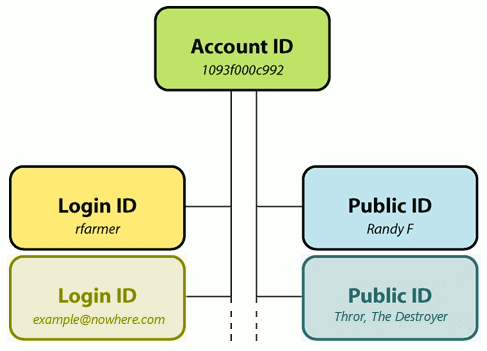
The author, Randy Farmer, found that a tripartite identity model would describe the needs expressed by most online services and more importantly, would be forward compatible with current identity sharing methods and future proposals.

He diagrams this most efficiently as:


Randy Farmer's Tripartite Identity Pattern postulates that the three components of user identity are: the account identifier, the login identifier, and the public identifier.

Read more about each of the elements and some interesting feedback on the pattern here.

Another interesting pattern in this regard is the use of a claims-based identity model. This revolves around the idea of claims i.e. a piece of information about an individual that is in doubt and must therefore be proved. Using an identity model based around claims allows individual identities to hold many disparate roles which can relate to different organisations as part of a wider ID metasystem. The way in which these claims are asserted and proven can be handled by a variety of technical solutions and services.

Microsoft's (where I also used to work) ASP.NET team documented the Geneva Framework as used for building claims-based applications and services for ASP.NET applications. Features include:

  • Security Token Services (STS)
  • Federated authentication from ASP.NET applications
  • Object Model that facilitates claims-based authorization form ASP.NET applications

The above definition was taken from the below URL, this webpage also gives a more in-depth look at what is a claims based system is and how the Geneva framework fits in.
http://msdn.microsoft.com/en-us/magazine/dd278426.aspx

Microsoft's Passport service which I worked on for a few years at Microsoft is a good example how this can work to provide identity services between applications.

Who Cares? Where is this going?

Federated and open identity systems ultimately lend themselves to a new identity pattern that I have yet to see documented, but I actually think I see it in use quite frequently, mostly when I comment on blogs. Frequently the comment I post is able to retrieve information such as username or real name and an avatar without ever exposing personally identifiable information that could be used for rude behavior such as spamming or harassing someone. However, what strikes me as the untapped potential in this emerging pattern is the concept of 'ownership' of my contributions as it relates to the persistence and distribution of that identity.

Activity as a function of Identity

If there were a fourth element to the tripartate identity that was activity this would complete the social pattern. I could consume or represent that identity in the context of contribution, content or context as appropriate and as subscribed to by the user who owns the activity and identity.

This would enable a double-click on an identity that could perform interesting new social functions:

  • Aggregate user output in the context of an experience essentially allowing me to view contributions of an individual expressed as an identity
  • Assimilate interest and behavior and express this as a contextual metaphor (e.g. a score, a weighting, etc)
This is actually already taking place in emerging social networks and leading edge news/blog sites and in my opinion brings new value to the definition of identity.

...to be continued.